No, this isn't a good copy.
YOU have copy the logos and paste them, if not it shouldn't be black boxes behind the logos. Except the PNG files, but now you used JPG.
The blue brush under "E for Everyone" is so annoying. *sigh* How old are you?
Your interest is appreciated, but the quality of this box is not along the lines of what we would like in our database here.
Please check out the forums here, or a number of places on the internet that offer tutorials for using your graphic design software more effectively, practice what you've learned, and then post your work in the forums so others artists can give you suggestions on what you can do to make it better.
To let you know, this is the first box I posted. You can't expect me to be perfect. I do agree with you though It's not very good. And when I called it the "Good Copy" I meant that it's better than the one I posted a day before which was worse. The blue paint under the E for everyone was to cover up some words that were on the picture. And I get you don't like it. I agree with you! I don't like it either! it's my first box art EVER. From now on, I'll try to make the quality better.
not a work set by a high standard
i'm pretty dissappointed and i've seen some good first boxes but nothin' like how terrible dis is.
i know u made dis with paint but you should've waited until u get a better software before posting dis. U could've made dis quite special
and usually first boxes always cathes people's attention
#16, I know. Mario is so high up because he's in the same picture as the backround so i couldn't move him down. And I didn't want to render anything because I only updated it because the first version was TERRIBLE, and I'd rather focus on new boxes instead of rendering a bunch of stuff on an old box.
#18, Ha ha, I know it is. I'm probbally going to update it again anyway. But like I said, I didn't want to spend alot of time updating this box. I'd rather focus on new boxes.
Okay, so I got a third and most likely final update for this box. Personally, I think it's miles better than all of the previous versions, but that's just my opinion.
 Super Mario Galaxy DS Box Cover Comments
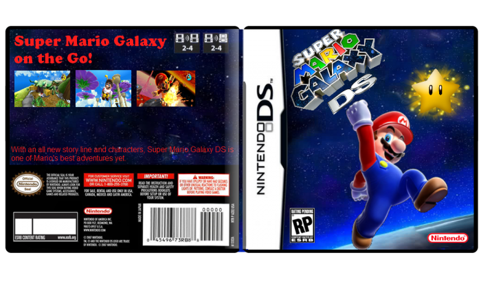
This is the good copy of the box art. sorry for the mistake the first time.
[ Reply ]
No, this isn't a good copy.
YOU have copy the logos and paste them, if not it shouldn't be black boxes behind the logos. Except the PNG files, but now you used JPG.
The blue brush under "E for Everyone" is so annoying. *sigh* How old are you?
[ Reply ]
paint vomit
[ Reply ]
Your interest is appreciated, but the quality of this box is not along the lines of what we would like in our database here.
Please check out the forums here, or a number of places on the internet that offer tutorials for using your graphic design software more effectively, practice what you've learned, and then post your work in the forums so others artists can give you suggestions on what you can do to make it better.
[ Reply ]
To let you know, this is the first box I posted. You can't expect me to be perfect. I do agree with you though It's not very good. And when I called it the "Good Copy" I meant that it's better than the one I posted a day before which was worse. The blue paint under the E for everyone was to cover up some words that were on the picture. And I get you don't like it. I agree with you! I don't like it either! it's my first box art EVER. From now on, I'll try to make the quality better.
Edited at 1 decade ago
[ Reply ]
Oh pleaase, not the "I am new and it was my first box, so you can't expect me to be perfect" drama again -.-
Stuff like this should go to the forums first.
[ Reply ]
#3, WOW! Such a nice thing to say about paint!
[ Reply ]
I'm going to update this box art when I get the chance. You guys dont seem to like it very much so....I'm going to update it.
Edited at 1 decade ago
[ Reply ]
#7, He said that because you should get a decent editing program like Photoshop, or GIMP.
[ Reply ]
get over it his/hers is bad but thats his first.What software do you use
[ Reply ]
HEY.
Be nice.
[ Reply ]
This box art was made with paint, but today I downloaded GIMP! I hope this will work better.
[ Reply ]
not a work set by a high standard
i'm pretty dissappointed and i've seen some good first boxes but nothin' like how terrible dis is.
i know u made dis with paint but you should've waited until u get a better software before posting dis. U could've made dis quite special
and usually first boxes always cathes people's attention
[ Reply ]
I know I'll admit it. It's bad. My other boxes are better.
[ Reply ]
UPDATE! I know it's still bad but it's better :)
[ Reply ]
It's actually kind of nice. Mario just needs to be moved down.
[ Reply ]
#16, I know. Mario is so high up because he's in the same picture as the backround so i couldn't move him down. And I didn't want to render anything because I only updated it because the first version was TERRIBLE, and I'd rather focus on new boxes instead of rendering a bunch of stuff on an old box.
[ Reply ]
It's just a wallpaper with a logo slapped on
[ Reply ]
#18, Ha ha, I know it is. I'm probbally going to update it again anyway. But like I said, I didn't want to spend alot of time updating this box. I'd rather focus on new boxes.
[ Reply ]
Okay, so I got a third and most likely final update for this box. Personally, I think it's miles better than all of the previous versions, but that's just my opinion.
[ Reply ]